The Four Critical Questions Every Home Page Must Answer
Last month I wrote about the importance of the subpages of your Web site. I gave the home page a pretty hard time because I think it gets too much attention. However, that doesn't mean that the home page is not important. It still is. After all, it probably IS the most visited page of your site, and is one of the most likely places that people will start looking if they get lost. With that in mind, it's my opinion that every home page is responsible for answering four basic questions. The priority of these questions will vary from site to site, but the questions are the same.
1. Where am I?
This is for visitors who are new to your site and may not know who you are. It's important that your site quickly communicates what your company does. This isn't limited to the text on the home page; it can also be accomplished in the graphics or template of the site. Sometimes your logo and company name alone may be sufficient.
2. Where do I go next?
The home page is where you set the global navigation of your Web site. I highly recommend that you don't change the main navigation of the site from page to page. When the navigation changes (for instance, changing from horizontal to vertical navigation), you force the visitors to re-orient themselves, which can lead to frustration and confusion. You can also make it easier on the visitor by limiting the number of options on the home page. While it might be tempting to put every important page directly on the home page, this often results in making it more difficult to find things. Far too often, I see companies who put a ton of links on the home page thinking that it will make things easier, only to begin an endless series of link one-upmanship
, as they try to solve the problem of links getting lost in the shuffle. "Let's try making that link bold...how about bold and red...maybe we need to make it blink." Before you know it, the page has lost all logical organization and still hasn't become any easier to use.
3. What's new?
This is specifically for returning visitors who have been to your site before and know who you are. For these visitors, you want to provide easy access to the most recent updates on your site. If anything has changed, you want to make it easy for them to find the new content without having to spot-check the different sections of your site. Providing RSS feeds for frequently changing sections can also be an easy way to let people know when you update your site. In addition to recent updates, it's probably also important to make it easy for visitors to access any parts of your site that are being advertised offline. If you are promoting your Web site with a specific print or broadcast campaign, you probably want to provide access to that information directly from the home page. Even if you provide a specific link in the advertising (e.g. villing.com/subscribe/), many visitors will simply go to your home page.
4. What's important?
It's critical that the visual design and layout of your home page effectively communicates to the visitor what is important on the page. By adjusting the relative sizing and position of the home page elements you can give your visitors visual cues that will help them quickly make sense of your content. In order to avoid the "link one-upmanship" trap I discussed in question two, it's important that the home page design is flexible enough to logically expand when you have new content. You don't want to have to start duct taping on extra banner ads because you didn't leave enough space on the home page. On the other hand, it's also critical to make the hard decisions on what NOT to show on the home page. Every new element you add to the home page will DECREASE the importance of all the other elements. (If you promote one item, it gets 100% of the attention...if you promote 25 items, each item now gets roughly 1/25th of the attention, and so on.)
To illustrate this, let's compare two banking Web sites:
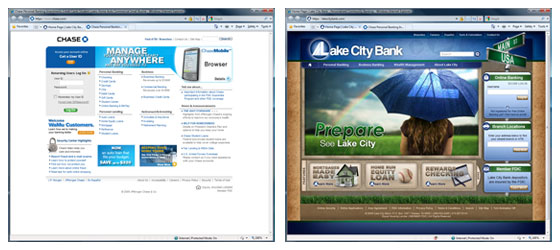
From these screenshots, you might assume that the Chase site* is providing a lot more links than the Lake City site. However, when I counted the links, I found that the difference is actually only TWO. Primarily by using drop-down menus and increasing the size of the site, Lake City Bank is providing essentially the same number of links, while doing a much better job of prioritizing them. My purpose is not to argue that the aesthetic design style of one site is superior to the other; that's a matter of personal preference. However, I don't think anyone can deny that there's much more visual prioritization of the elements on the Lake City home page. It's very clear which elements are critical, which are secondary and which are very minor. The Chase site, in contrast, offers very little visual indication of what's important.
As you may have encountered with your current Web site, it's often difficult to fix these issues after the fact. These things need to be considered as you are designing your home page so that the overall design doesn't become cluttered as your promotional needs change. By planning ahead and considering these four questions, you can make sure that your home page is an effective tool for your company.
* This screenshot was taken on October 29, 2009. Chase may have updated their site since that date.
To get our latest articles when they are posted, please subscribe by e-mail or RSS.