Mad Men Unstuck in Time, Part 2 - From Handlebar Mustaches to Fedoras
Let's yank back the handle on H.G.Wells' famed contraption and head back to his neck of the chronological woods: the early 20th century. And what should we do there (or then, rather)? Rewrite history by warning everyone about the dark shadow looming in Europe? Bring back post-Prohibition goodies for the thirsty and deprived masses? Nah. Let's get a laugh at the old-timey ads instead!
As I started unearthing ads, it seemed wise to cover the entire prewar era in this article. That way we can focus on more specific Mad Men decades ('50s and '60s) in follow-ups. Also, much could be said about the evolution of political correctness, so I'll do my best to skip all the absurdly sexist and racist ads. My main objective is to look at how much the style and approach of advertising has changed, and less to comment on the evolution of social taboos and norms. Here, I'm thinking about layout, font and illustration choices, style, length, use of humor, etc.
I'll put in my brief two cents here and there, but for the most part, I think the ads speak for themselves. It's surprising how much some of them are not so unlike contemporary ads and others feel like they're from another universe.
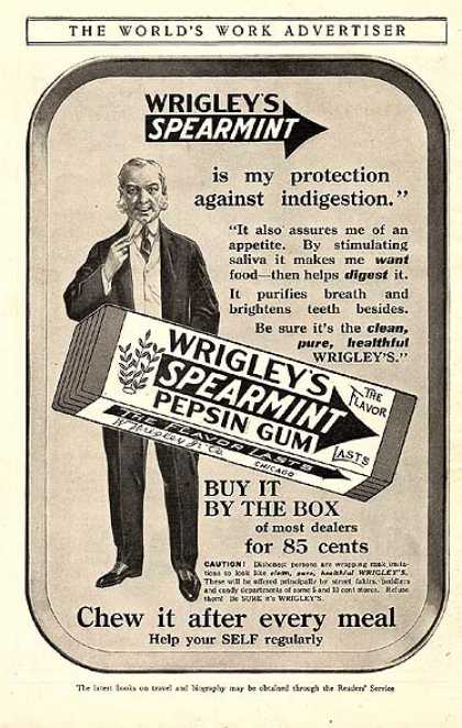
Who knew chewing gum assures one of an appetite? In many ways—despite the creepy olden-time dude leering at the viewer—this is a lot like current ads. We have a large product image, recognizable logo and relatively brief copy. I especially love that everything is hand drawn, an art form that is sadly becoming lost in the advertising world.
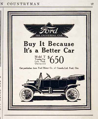
This struck me as way ahead of its time. Large strong logo. Large image of beautiful product that speaks for itself. Clever, direct, short headline. It's like a modern Apple ad although published just shy of a hundred years ago! If you've got a great product, this sort of simplicity must be timeless.
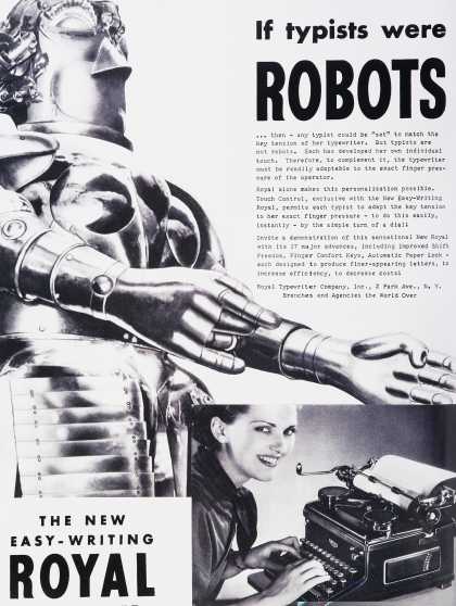
This was the vision of the future to people in the '30s: apparently the "Metropolis" android in every home. Is it just me or does the Roomba not quite itch that scratch? The eye-catching image and comedic concept still seems relevant today.
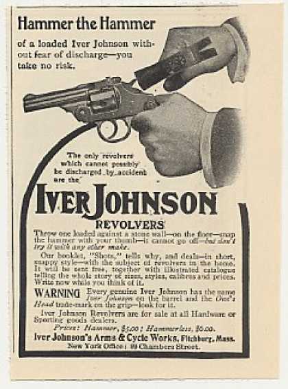
This must have been before they started advising "Don't try this at home." Jeesh.
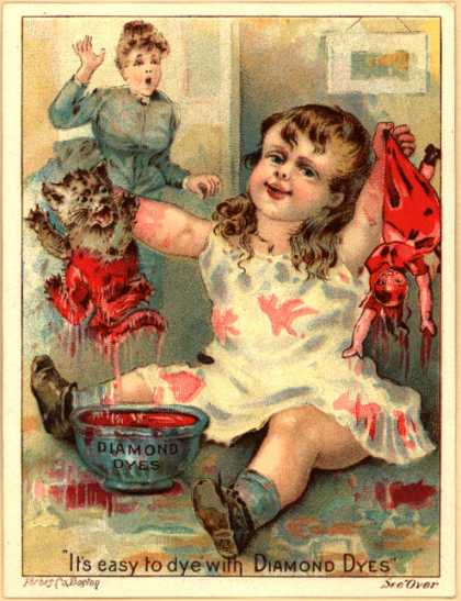
Is the goal to make it so the consumer can't sleep at night?
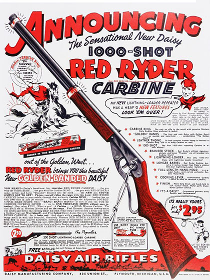
The only thing that's missing in this model is "a compass in the stock and this thing which tells time". Here's an ad style that is truly extinct in magazines. While you don't see ads directed at kids with this level of detail any more, the backs of cereal boxes often still have this level of complexity. Also, the tie-ins with popular characters from movies and TV shows is still a very common marketing tool.
In the next article we'll visit the youthful days of the Baby Boomers of the late '40s through the '50s, back when Don Draper was still a lowly car salesman and skirts with curly-haired dogs on them were swell.
To get our latest articles when they are posted, please subscribe by e-mail or RSS.