
Feel the Burn: No Critical Pain, No Creative Gain.
In recent posts we’ve taken you behind the scenes with our “Concept to Completion” series. Let’s again step backstage and peek into the nuts and bolts of the creative clockwork, but this time I’d like to zoom in a little and talk specifically about the internal back-and-forth revisions that mold a rough design from a hunk of raw pixels into a glimmering, client-ready product.
Any designer will tell you that criticism is no fun. And revisions…let’s face it, they stink! You’ve shaped your baby from scratch, pulled it from the cobwebbed recesses of your mind into a Photoshop reality, and you know darn well it’s good. No need for critique. Print that badboy. What’s for lunch?
Nobody wants to hear the bitter truth calling our masterpieces into question. But in reality, regardless of how in love we are with our creations, nearly every design can be improved—often, a lot. Yours and mine included. In the throes of inspiration, we artists often fall in love with arbitrary decisions we’ve made without ever asking ourselves why. I’d like to illustrate this point with a little tale about a design I did a couple months back.
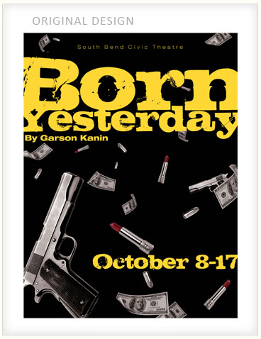
It was up to me to create a poster for the play “Born Yesterday”. I read the story synopsis and learned that it was about a woman who gets caught up in a world of crime. Playing on visuals that would suggest femininity and foul play, I chose lipstick, guns and money for design elements. I added a black background and grungy yellow lettering to reinforce the dark visuals. Not too shabby, I told myself (below).
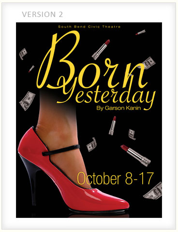
After my design made its trek around the office, including dropping by the creative director’s desk, this was my sad discovery: “Born Yesterday” is a comedy (I don’t know how I missed that) and my concoction screamed, “Crime drama!” My instructions were to downplay the guns and add a woman’s high-heeled shoe to lighten the tone.
Here’s the bizarre part: my initial response was resistance. I liked my design just fine and even tricked myself into believing that it could work for a comedy. Looking back, I can’t imagine why. The feedback was dead-on. For a light-hearted satire, the poster I created was horrible. Plus, it looked like a rip-off ad for “Jackie Brown”. Regardless of that harsh reality, I still wanted to believe the initial design worked. Reluctantly, I complied and redesigned (below).
Take two comes back with fresh commentary. This time, the woman’s shoe and font choice “just don’t say fifties”. I’m irritated. So, I gave ‘er another crack, taking care to find fonts that were used in 1950s posters. I’m thinking, we need groceries, don’t we?
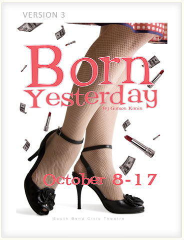
Still no go. Bummer. “Closer, but not quite there,” the boss says. The fishnet stockings aren’t really working. By now, though exasperated, I’m feeling inspiration. I recognize what is sort of working and what isn’t. If I’m honest with myself, I’m not crazy about any of the redesigns I’ve completed thus far either, and I’ve learned a few things along the way. I’ve thought about things I otherwise wouldn’t have.
With a clearer direction, I realized that a more feminine route in terms of color might be wise and a more playful tone as well. Something clicked. I went a totally different direction. Fourth time’s the charm, I thought (below).
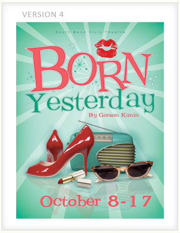
I was “feelin’ it” now, but for good measure I got advice from Senior Art Director Ron Doyle about how to improve the concept. He liked it and suggested using a pink and brown look, which was also a popular color scheme in the 1950s, just to have an alternate of my final design (below).
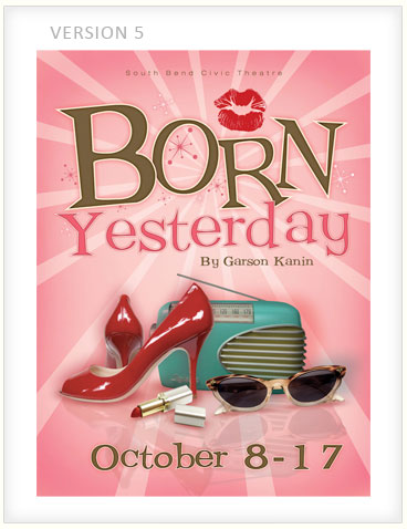
Approval! They go with mint green and it’s finally off to the printer. Whew!
Though the process was frustrating, I’m pleased with that final design. After looking through all of the versions with fresher eyes, I realized something: the final design really was substantially stronger than the first. It was more feminine, playful, comedic and visually interesting. More importantly, it actually matched the feel of the play. For what it needed to be, it was just plain better.
It dawned on me that if it weren’t for the tedious journey of revisions, I would have never gotten there. There’s a reason authors and film directors have editors. And there’s a reason those relationships are often love/hate. Sometimes the push needs to come from someone who knows what they’re talking about, someone with fresh vision who can hold the lantern higher to show the possible paths. Without this feedback, I would have settled with “good enough”. Worse yet, I might have left believing my first design was the best I could do.
The reality is that it will always be a pain to hear criticism and have to make revisions. It’s just the uncomfortable reality of any art form. But it’s helpful to humbly realize that there is always room for improvement and you probably do have something better up your sleeve; you just need someone else to help you with the magic. I know it may be a little cliché to talk about the importance of teamwork, but putting pride aside and relying on the aide of others really is a great tool to sharpen your skills.
No exercise is fun, but if you don’t feel the burn, you’re not getting anywhere.