
Concept to Completion – Creating a Kinetic Typography TV Commercial
Kinetic typography sounds a lot more complicated than it actually is. Really, it’s just a fancy video term that essentially means “moving text.” It may come as a surprise to some of us younger folks that kinetic typography has actually been around for quite a while. In the 1950s and 60s it was not uncommon to see moving text in the opening credits of movies such as “North by Northwest,” “Pink Panther” and “Vertigo.”
These visual effects were originally created using complex optical tricks on film negatives, building image sequences literally by hand. Using old techniques, a kinetic typographic sequence could take several weeks to execute. But recently, kinetic typography has dramatically increased in popularity thanks to advances in computer technology which make production much more feasible on small budgets with fairly ordinary computers.
The really exciting thing about kinetic typography is that it can be used as a tool to present words in a visually stimulating way. An otherwise stale message can be made much more engaging just by animating text in a pleasing visual fashion. Kinetic typography is an indispensible technique in any motion graphics tool chest.
Recently I had the opportunity to collaborate with Mathew Siecker on a TV spot for Lake City Bank. Matt suggested that this would be a perfect opportunity to flex our kinetic typography muscles and I agreed. So Matt set out to design the look of the commercial by creating a style sheet. Most motion graphics projects begin with a style sheet and/or storyboard to give the client a good idea how the finished spot will look and feel.

Once the overall concept was approved, we were ready to move on to the production phase. Because kinetic typography by its very nature is so dependent on the words themselves, it was integral to first record the voiceover track before moving forward. We chose a conversational female voice to strengthen the personal feel of our message. Once we had the voice track in place, we decided to incorporate the strong blues, tans and greens from the new Web site we recently designed for Lake City Bank.
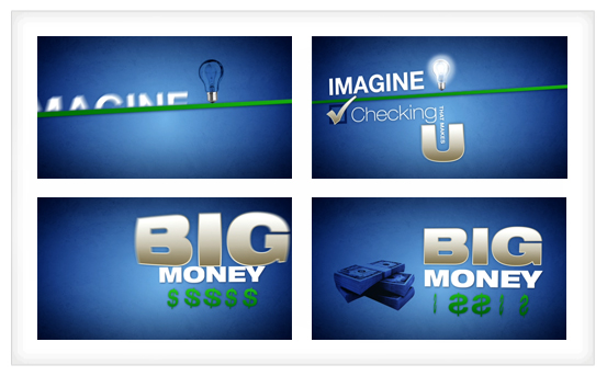
Borrowing from the look of the Web site, I began designing and animating the first few seconds of the spot. I sent this to Matt to get the juices flowing. Below are some stills from the beginning of the video. This served as a nice jumping-off point for Matt and me to brainstorm additional ideas.
Using the style of the beginning of the commercial as a template, we thought of additional design elements and ways to incorporate them and make them move. I then finished the animation and after some internal tweaking it was ready to go.
Kinetic typography is a visually powerful technique. Sometimes it can stand alone. Other times it works best when driven by a strong voiceover. Either way, it’s a lot of fun and we look forward to exploring it and other techniques further in the future. And, as always, we’ll share our observations with you.