Dealing with Screen Size on the Web Part 2: A Potential Solution
As I explained in the first article in this series, designing a website that works for every popular screen size is becoming more challenging.
The 7-inch Kindle Fire is the second-best-selling tablet of all time and with Apple’s recent release of the iPad Mini, the 7-inch form factor is poised to have a major impact moving forward. The problem is that this size is too small to comfortably browse a website designed for desktops and too large to simply use the mobile design. It’s at an awkward in-between size that our current solutions aren’t optimized to handle. That has led many web developers to push for a new standard in web design, which aims to eliminate this problem once and for all: responsive web design.
Responsive Web Design
Responsive web design aims to eliminate the problem of screen size by designing the site in a way that subtly changes based on the horizontal size of the screen. Unlike simply flowing text across the entire screen, the website’s individual elements are modified in small, but significant ways to accommodate the different screen sizes. For instance, an article with two columns, might change to four columns at a very large size, or one column for a very small size. Images might be enlarged or shrunk. Navigation and secondary site details might be moved around.
For instance, back in early 2008, we used this technique for Elkhart Brass. Our goal was to accommodate visitors who were using the declining, but still popular (at the time) resolution of 800×600, even though we were targeting visitors using 1024×768 or higher.

You can see from this image that we decreased the size of the top header graphic and removed the left column for visitors at 800×600. This allowed visitors on smaller screens to view the site without having to scroll from left to right, and made better use of the additional space allowed by larger screens. The content itself wasn’t removed, it was just handled differently in the layout.
Adding More Variations
Modern responsive web design takes this strategy even further, by encouraging even more variations to accommodate a greater number of screen sizes. The exact breaking points will vary based on the content and design of the site. Below, I’ve listed some important breakpoints for reference. I’ve bolded the breakpoints that I think could typically be considered as “major” breakpoints. The others would be very minor adjustments to things like font size and spacing.
- 320×480 – Smartphone portrait
- 480×320 – Smartphone landscape
- 600×800 – Small tablet portrait
- 800×600 – Small tablet landscape
- 768×1024 – Tablet portrait
- 1024×768 – Tablet landscape
- 1280×800 – Laptop
- 1600×1050 – Small desktop
- 1920×1080 – Large desktop
- 2560×1440 – Huge desktop
Even at the major breakpoints, the design doesn’t need to change dramatically. Just like my Elkhart Brass example, the changes will probably be subtle adjustments to how content is split into columns.
Determining the Number of Variations
Rigorous testing is the best way to determine the precise pixel size and number of the breakpoints. By resizing the browser window on your own screen, you can see where the design becomes difficult to use. If that happens, a new breakpoint is probably needed. It’s not necessary that everything fits perfectly on every screen…that’s nearly impossible; it’s more important that the visitor’s experience isn’t frustrating or difficult because of the way the website fits on their screen.
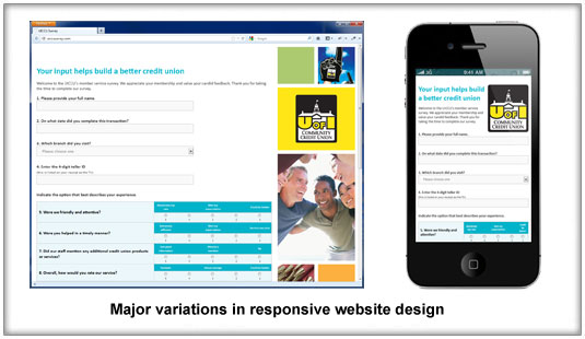
Recently, we did a small, one-page website for the University of Iowa Community Credit Union. Our goal was to make an online survey that would be highly user-friendly and easy to fill out. In order to accomplish that, we made very minor adjustments to the font size and layout to accommodate different screen sizes. Once the screen resolution was very small, however, we had to make a major change by removing some of the graphics.

When you visit the site and resize your browser window, you can see that the font size and spacing changes depending on the size, making the content and survey highly usable at almost any resolution. Basing the variations on the dimensions of the browser, rather than the device enables desktop users on larger screens to take advantage of the smaller layouts when they resize their browser to multi-task.
Responsive web design is more complex than what we’ve done in the past, and requires coordination between the website designer and programmer. However, there are big usability benefits that are likely to be worth the cost. By taking the extra care to design a website that fits well on every device, you’ll ensure that every visitor has the best experience possible.