Concept to Completion – Building a High-Impact Financial Web Site: Part 1
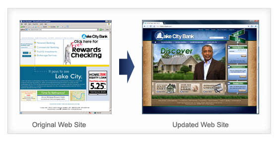
Over the past few years at Villing & Company, I’ve been involved in building quite a few Web sites. Both large and small sites. Sites that I’m proud of, and (as you might imagine) some sites that didn’t always measure up to my expectations. Villing & Company recently launched a site that may be one of our most ambitious projects to date – the new Web site for Lake City Bank, headquartered in Warsaw, Indiana. After a lengthy process of planning and development, the site finally went live on September 1st at lakecitybank.com.
The new site combines cutting-edge HTML and CSS design techniques, the latest advances in 3D Flash technology and a bandwidth-saving, JavaScript-based navigation system that would have been unheard of several years ago. It may not be immediately obvious how much work goes into a site like this, so in this article, I’m going to walk through the process, from planning to design, from programming to testing.

PLANNING
The success of a Web site is all about the planning. You can avoid a lot of headaches by properly defining the goals of the site as a whole, as well as spending some time on the site outline, home page content and primary navigation. In the case of Lake City Bank, there were two primary issues that we needed to deal with:
- The home page needed to appropriately display and prioritize current promotions.
- The many sub-pages of the site needed to be strategically organized, and the navigation needed to make it easy to find information.
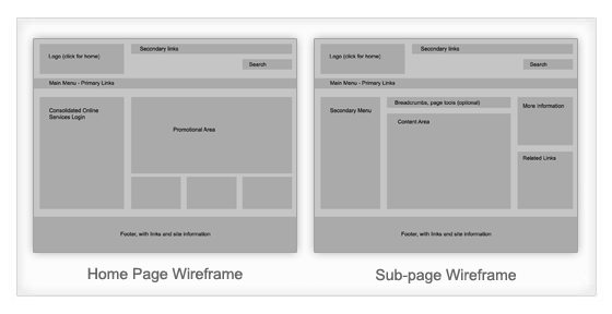
To solve these issues, we organized the pages of their Web site into appropriate categories and created wireframe diagrams of the home page and sub-pages of the site.

DESIGN
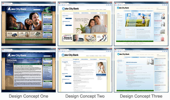
After agreeing on these basics, we were ready to have our creative team add the graphics. The difficulty here is the subjectivity of graphic design. Not only do different people within the same company often have different ideas of what is attractive, but different companies have their own unique preferences and styles that can influence the final project. Because of this, we had three different designers present their take on what the site should look like. Each designer was working from the same basic site outline and knew the objectives for the home page and sub-page concepts. After internal review and some tweaking, we presented the following three designs.

Each design had distinct pros and cons, and we made some minor edits to each design before our client at Lake City Bank decided on the first concept. Using our original concept, we incorporated some of the input from the client and worked through some more of the different types of pages on the site. In the end, we had three basic types of pages: the home page, category pages and content pages. Each of these looked slightly different, but maintained the overall graphic theme of the site nicely.

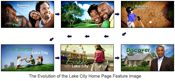
At this point, we also started experimenting with different graphics for the main home page image. Over the course of the project, the featured image changed several times. I pulled some examples of the home page image to show how the final idea evolved from the original concept. In the end, we decided on using subtle, animated still shots, which focused attention on the needs and motivations of the Lake City customer. As you will notice if you look at the live site, some of these ideas made their way into the final version in one form or another.

In the next article, I’ll explain the multi-month process of programming and preparing the content for the final Web site, some of the setbacks we encountered and how we ended up solving the more difficult challenges.