Concept to Completion – Building a High-Impact Financial Web Site: Part 2
In the previous article, I discussed the planning and design stages of building the Lake City Bank Web site. Of course, you can have the coolest design out there, but if the site doesn’t work right, or is difficult to maintain, it just won’t be useful.
“Programming” is a somewhat scary term to most marketers, and it certainly doesn’t sound nearly as interesting as “strategy” or “graphic design.” However, in my opinion, programming is a perfect blend of art and science. While there are many different ways to accomplish the same objective, there are measurable advantages of some ideas over others.
CREATING THE TEMPLATE
Many of you may not realize what’s involved in creating a Web site template from a static, visual concept. I usually receive a layered, PhotoShop file from the designer, but that’s only the beginning. From that visual concept, I analyze each individual graphic piece of the design to determine:
- what must remain consistent from page to page.
- what areas of the site need to expand and contract (both vertically and horizontally).
- where I can save file size by heavily optimizing or tiling background graphics.
- which graphics are part of the page “content” and which are merely background decoration.
Once I’ve analyzed the design, I hand-code a clean, working HTML document that contains all the content for a single page. I use this page to develop the CSS (cascading style sheets) for the site. Using CSS, I’m able to take the plain, boring HTML page and manipulate it to match the PhotoShop concept. To illustrate what I mean, here’s what the page looks like before adding the CSS, and here’s what it looks like after adding the CSS. To document my process for this article, I took a screen shot every time I added some CSS code. Then, I had our video editor string all 154 screen shots together so you can see how the site gradually comes to life.
SOLVING PROBLEMS, ADDING ANIMATION
 As you can probably tell by looking at the site, we’re using a ton of large graphics. While this looks great, it has the potential of causing some performance problems. Delays might not bother people with slow Internet connections who are used to waiting for Web sites, but we wanted the site to feel snappy for most visitors.
This led us to build an animated framework on top of the working site, which enabled us to refresh only the content that actually changed on each page, rather than reloading the whole page. The result is that after you have browsed to an interior section of the Web site, page loads are nearly instantaneous. As an added bonus, we were able to create slick transition animations as you move page-to-page, with sliding menus, fading images and Flash animation.
During testing, we found that slower computers had trouble rendering the transition effects, so we added a convenient way to “opt-out” of the animated experience. Turning off animation eliminates the advantages of the instantaneous page transitions, but provides a better experience for visitors with low-end hardware. We also eliminated the animated experience for visitors using IE6 (Internet Explorer 6), since it has trouble rendering the animation and is likely to be used on slower machines.
FINISHING TOUCHES
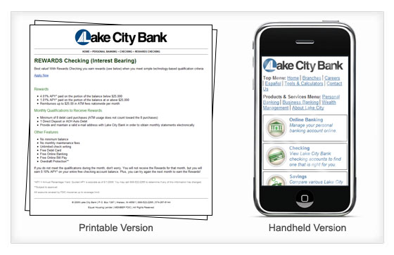
It’s important to build the site in a way that it is properly formatted for different situations. We created both a printable version of the Web site, as well as a handheld version. Both alternate versions of the site work from the primary URL (on supported devices) as well as their own dedicated URLs: https://print.lakecitybank.com and https://m.lakecitybank.com. (Of course, since we’ve removed most of the navigation on the printable version, it’s not exactly “browsable.”)

Finally, we added Google Analytics to track visitor trends and statistics. With a site this complicated, the default Google Analytics code wouldn’t have worked. We modified the tracking scripts so that no matter how the visitor viewed a page it would be recorded appropriately and the statistics reports would be optimized for evaluating site performance and visitor behavior.
WRAPPING IT ALL UP
At Villing & Company, we are extremely proud of what we’ve been able to accomplish with this site. With the help and expertise of some very talented people at Lake City Bank, we were able to create a site that (in my biased opinion) packs a ton of creative punch.