Dealing with Screen Size on the Web Part 1: The Current Situation
Since the beginning of the Internet, website developers have had to deal with the fact that people browse the web on monitors of different sizes. Over the years, this problem has become increasingly difficult to solve because screens are getting both larger and smaller. On one hand, smartphones have made small-screen browsing commonplace; on the other hand, many people browse the web on their TV sets, which can easily be larger than 50 inches. As large monitors become more affordable on desktop computers, netbooks and tablet devices continue to fill every conceivable gap between the traditional 15-inch laptop screen and the 4-inch smartphone screen.
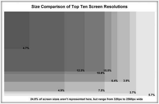
More than ever before, it’s become impossible to build a website with a one-size-fits-all mentality. The list of the top ten screen resolutions contains both 1920×1080 and 320×480 (resolutions are described by their width and height in pixels). As you can see from the image below, there’s a lot of variation, even in the most popular resolutions.

This image shows that even the most popular resolution only has 15.5% of visitors, so it’s become very difficult to generalize. While it’s always been possible to create layouts where the text expands to fill the entire screen at every size, this often causes more problems than it solves. Viewing the layout of any newspaper will show you that text is easier to read when it’s in manageable columns, rather than long horizontal strings. It can also be difficult to manage imagery when the text is so flexible. So, while that solution may work for simplistic, text-heavy sites like Wikipedia, it often doesn’t work for sites that require more intentional layouts and imagery.
So what are our options?
Targeting a Minimum Resolution
The traditional solution has been to target a minimum resolution. 640×480 in the 90s, 800×600 in early 2000s and 1024×768 more recently. This means that people using screens at a smaller size will need to zoom out, or scroll from side-to-side. At the same time, people using larger screen sizes will have a lot of unused space along the sides of the content. This solution has worked pretty well, and designers have become skilled at using the edges of the site in a way that’s appealing on larger screens. For instance, in the image below you can see what the Lake City Bank website looks like at various screen resolutions.

At 1024×768, the content fills the screen; at 800×600, the content is too big to fit on the screen, so the visitor would need to scroll sideways to see everything, which isn’t ideal; at 1920×1080 there’s a lot of unused space on the screen and although the designer has tried to minimize the impact by creatively using graphics, it’s still not ideal. However, since most traditional computers use resolutions between 1024 and 1900, the site works pretty well for most cases.
This solution became less effective, however, when smartphones became so prevalent. Apple “solved” the problem by making it relatively easy to zoom and pan around websites that were too large to fit comfortably on the screen, but this was a band-aid that doesn’t provide the best experience for visitors. It’s far better to browse sites that have been properly formatted to fit your screen without zooming and panning around. This led to a two-tier approach, which is quite common today.
Creating a Separate Design for Small Screen Devices
After the iPhone took off in late 2007 and smartphones became commonplace, many companies began to design websites in two tiers: one design for traditional computers targeting a minimum resolution and a separate design for mobile devices. The image below shows how we did this for a recent website, which had an important mobile audience.

As you can see, the content is formatted to fit the small screen and make it easy for visitors on mobile devices to navigate without constantly zooming in and out or panning. This solution is probably a good one for today, but it’s very likely that it won’t be enough for the future.
In the next article, I’ll explain a method that has the potential to solve this problem completely.