
When Villing & Company was the new kid on the block
On several occasions, I’ve written in this space about how our industry has changed since we were the fresh-faced kids in the biz. Back in 1982 when Jeannine and I started Villing & Company, we were probably more concerned about putting food on the table for our young kids than contemplating what the future might hold.
With the passing of some of our colleagues and peers, and the retirement of others, it is hard not do some gazing into the rear view mirror of a professional life well loved. In those early days, it was just three of us – Jeannine, me and our dear friend and colleague, the late Joe Van Huffel. Together, we jerry-rigged a working office in 500 square feet of space with no capital other than our meager life savings and no clue as to what we had gotten ourselves into. But we loved our craft and looked forward with great anticipation every time a client ad appeared in the newspaper or a brochure came off the printing press.
Today I thought I’d share a couple of examples that are especially poignant to us. One of our earliest clients was National Bank of South Bend. The ad pictured here was literally the first we ever published. It is interesting on several levels – most of which speak to how advertising has changed in 35 years.
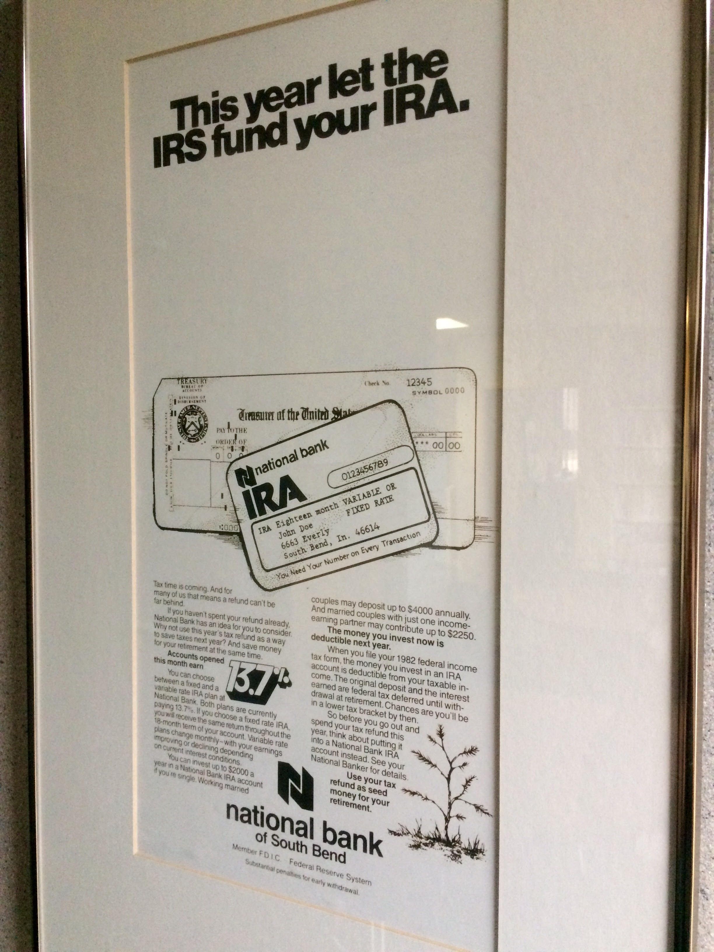
By today’s standards, the amount of text in the ad is startling. At the time, Individual Retirement Accounts (IRAs) were just becoming popular as bank products. And check out the interest rate. Wouldn’t we all love to have rates that high these days? (Of course, it would also mean loan rates would be proportionately higher.) National Bank was a huge proponent of local newspaper advertising. This ad became the first in a long running series that were designed in a style unique to that client. Today we would call that branding.
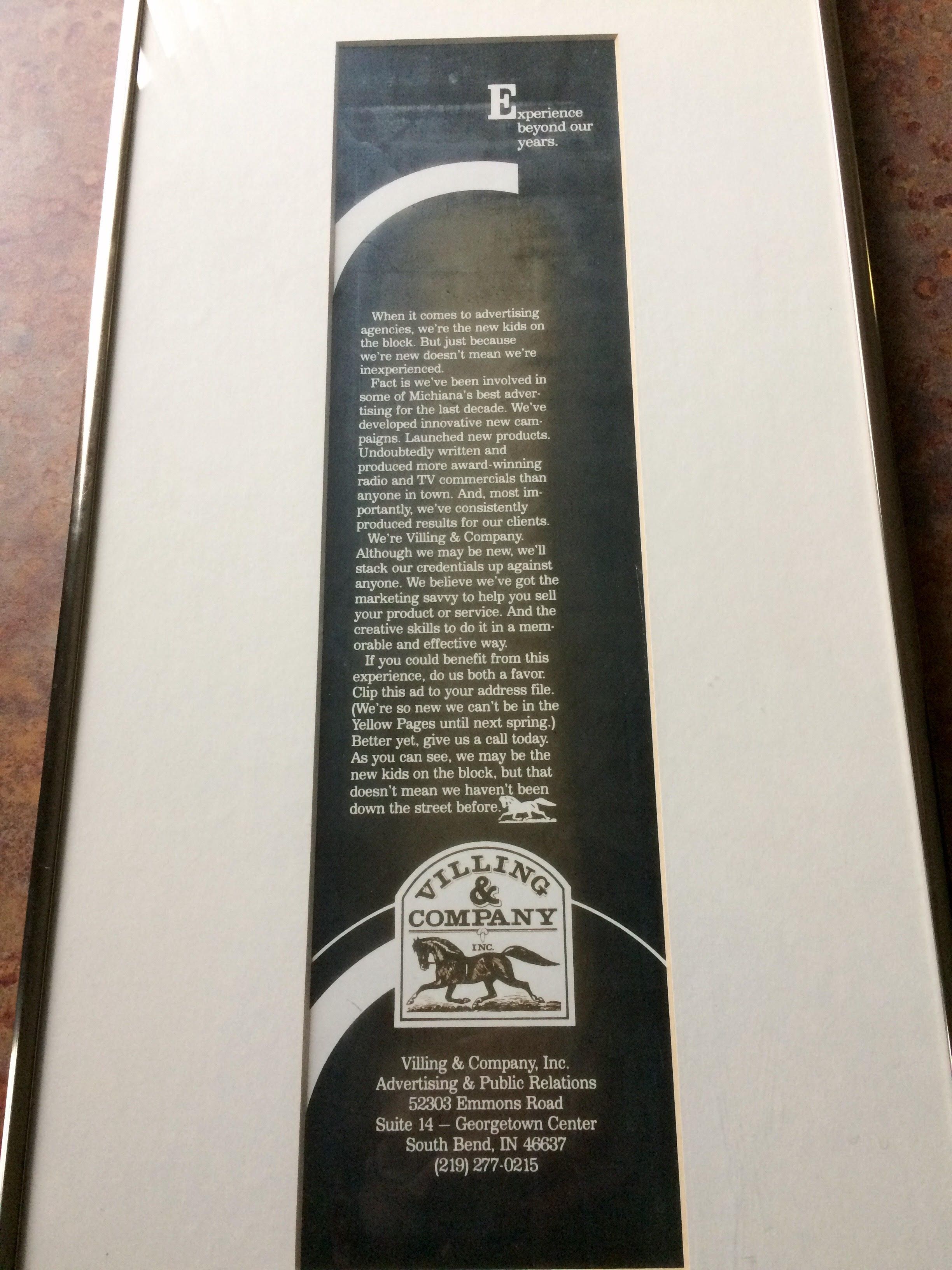
Another ad, published about the same time in the local community magazine, was for our agency. As you can see, we readily acknowledged our inexperience as agency owners, but spoke with bravado that, in hindsight, I find almost surprising. Those of you who have know us less than 20 years may also find the logo of interest. The inspiration for the logo was the woodcut of the horse that appeared on my grandfather’s letterhead. He was a German immigrant who owned a blacksmith shop in Cincinnati.
By today’s advertising design standards, these ads may look odd. But at the risk of a little more bravado, I believe there is a key statement in the Villing & Company ad that still speaks to our professional philosophy: “We believe we’ve got the marketing savvy to help you sell your product or service. And the creative skills to do it in a memorable and effective way.”
This post is part of a weeklong anniversary celebration. For more throwback content, visit the Villing & Company Facebook page.