iStock Legos or How I Learned to Stop Worrying and Love Cheap Photography: Part 2
Well, here I am, back for part two. You should know that, as promised, I just completed the most breathtaking Lego starship in the universe and it's waiting by the front door so I can show my dad the instant he gets home from work. I'm going to need him to confirm the flawless quality of its craftsmanship.
While I'm waiting for pops to arrive, let's talk about another great childhood pastime of mine: collecting things. As a youngster, I collected rocks, baseball cards, coins and candy. Okay, mostly I collected candy. And the coin collecting was really just saving spare change to finance my candy addiction. But the point is: I liked to collect things and I still do. About three years ago I started collecting the "Design of the Week" from iStockphoto.
Every week the staff at iStock chooses one design from hundreds of submissions as their "Design of the Week". I've highlighted a few below which clearly illustrate that cheap online stock photography can (and should) be used like Legos to build a visual masterpiece. One stock photo often won't do the trick.
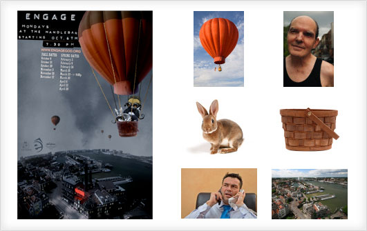
The first example below was created by Blake Berg of Wayfarer. The final design on the left was created from the stock photos displayed on the right. As you can see, Blake treated each of the stock images as a single Lego in the finished creative structure. Many of the individual photos are plain and forgettable, but when combined, they became this dramatic, quirky poster that really commands attention.

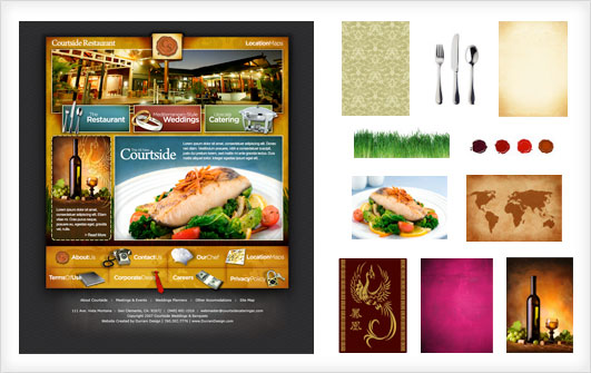
This next example is a web design created by Jett Green of Durrani Design. Here we see that many of the original photos have been manipulated practically beyond recognition. The violet texture (bottom middle) has been transformed into an orange hue to supply the main color scheme of the site. Also, the wallpaper at the top left has been employed as the dark gray background texture. By envisioning the potential of an ordinary photo, a world of artistic opportunities emerges.

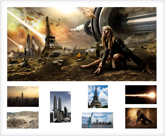
I saved the best for last. This final example is one of the most impressive composites of cheap stock photography I have ever seen. This design was created by Drew Williams of Pressure. Here we see that the sky is the limit when using low cost stock photography. Every single stock image was carefully chosen and blended to create this stunning, seamless apocalyptic landscape. It's amazing what can be done with such mundane starting material.

Since I began collecting the iStock "Design of the Week", I've learned that with a Lego builder's creative mentality, not even the tiniest photography budget can stop you from producing an amazing work of art.
Now, if you'll excuse me, all this talk of candy has given me a craving for some Reese's Pieces, so I'm off to check the couch for some spare change.
To get our latest articles when they are posted, please subscribe by e-mail or RSS.
