Monday Morning Quarterbacking the JCPenny Logo Changes
To say that JCPenny is undergoing a bit of an identity crisis is akin to observing that American Idol experienced a slight ratings slump this season. Given Penney's schizophrenic behavior, it would be easy to second-guess some of the strategic decisions made by the short-lived regime of its former CEO Ron Johnson leading to the company's serious decline in sales. But the purpose of this particular article is to specifically analyze how the logo modifications made by the organization over the last two to three years have contributed to an astounding decrease in awareness of the century-old brand.
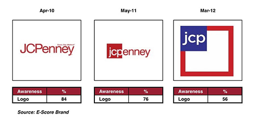
Based on the logo featured at the end of the company's recent apology ad, it appears that JCPenny is now featuring its fourth logo variation in the last three years - not exactly the recipe for successfully handling a brand with as much equity as Penny's. Let's look at the succession of recent logo changes to see where a well-intended rebranding effort may have jumped the tracks.

Personally, I think the shift from the 2010 logo to the 2011 logo was a nice, logical upgrade of the brand. Font and colors stayed the same with the only significant changes being the "JCP" font change from uppercase to a more contemporary lowercase and boxing those initials in the traditional JCPenny colors.
Looking back, one can see that the intention was to isolate just the "jcp" in an effort to make the red box it is housed in as identifiable over time as the circular bulls-eye of Target. The only problem is JCPenny got impatient and launched into the red, white and blue logo a mere 10 months after the last logo change and, for the first time, totally removed any reference to the name Penny - a brash move considering it had been known simply as Penny's to generations of Americans.
It's as if they wanted to emulate companies like Kentucky Fried Chicken, who transitioned to KFC back in the early 1990s. The difference, however, is that Kentucky Fried Chicken switched to KFC in part because KFC is the name they were already referred to as by most consumers. Same with FedEx - who changed from Federal Express in 2000 for the same reasons.
My assumption is that JCPenny wasn't reacting to a public that was already calling the retailer "jcp," but wanted to be known by that moniker because it sounded hipper and more contemporary. Unfortunately, you can't quickly force such a change on people if they're not calling for it. Thus, the Titanic drop of 28 percent in consumer awareness of the brand in just two short years.
If the company would have stayed with the May, 2011 logo version longer and really given it a chance to serve as a transition logo, then maybe they could have slowly rolled out just the "jcp" in the burgundy box a few years later or used it in conjunction with the full logo to help ease the transition. Instead, they panicked in their urgency to show how trendy and different they were and turned their back on an iconic brand identity before people knew what hit them.
Now, in desperation, it appears they are once again embracing the equity they have left in the JCPenny brand in order to stop the bleeding.
Certainly, the rash logo metamorphosis is not the predominant reason for JCPenny's slumping sales over the last few years as the mismanagement and poor direction of the company are well documented. However, it is an example of an organization over-reacting to market conditions and ultimately, a case study in how not to treat a brand that was, at one time, as arguably recognizable as Coca Cola or McDonald's. It will be interesting to see just how much brand identity JCPenny can salvage by a potential return to its brand roots.
To get our latest articles when they are posted, please subscribe by e-mail or RSS.
