Why is there so much bad design in outdoor advertising?
Because I tend to drive around town quite a bit and I am a professional nerd when it comes to advertising, I look at a lot of billboards. Stated more precisely, I look at a lot of badly designed billboards.
I have theories on why this is, which I will share momentarily. But one of the great surprises is that some of these bad designs come from the least likely sources. I am talking about some of the national public service placements by organizations like the Ad Council. The Ad Council does a lot of good work using major national agencies to create campaigns promoting many worthwhile causes. I’m not sure if junior art directors are assigned to do the design work for the outdoor advertising, but all too frequently, the primary message and/or sponsored organization is depicted in such small type as to be virtually unrecognizable.
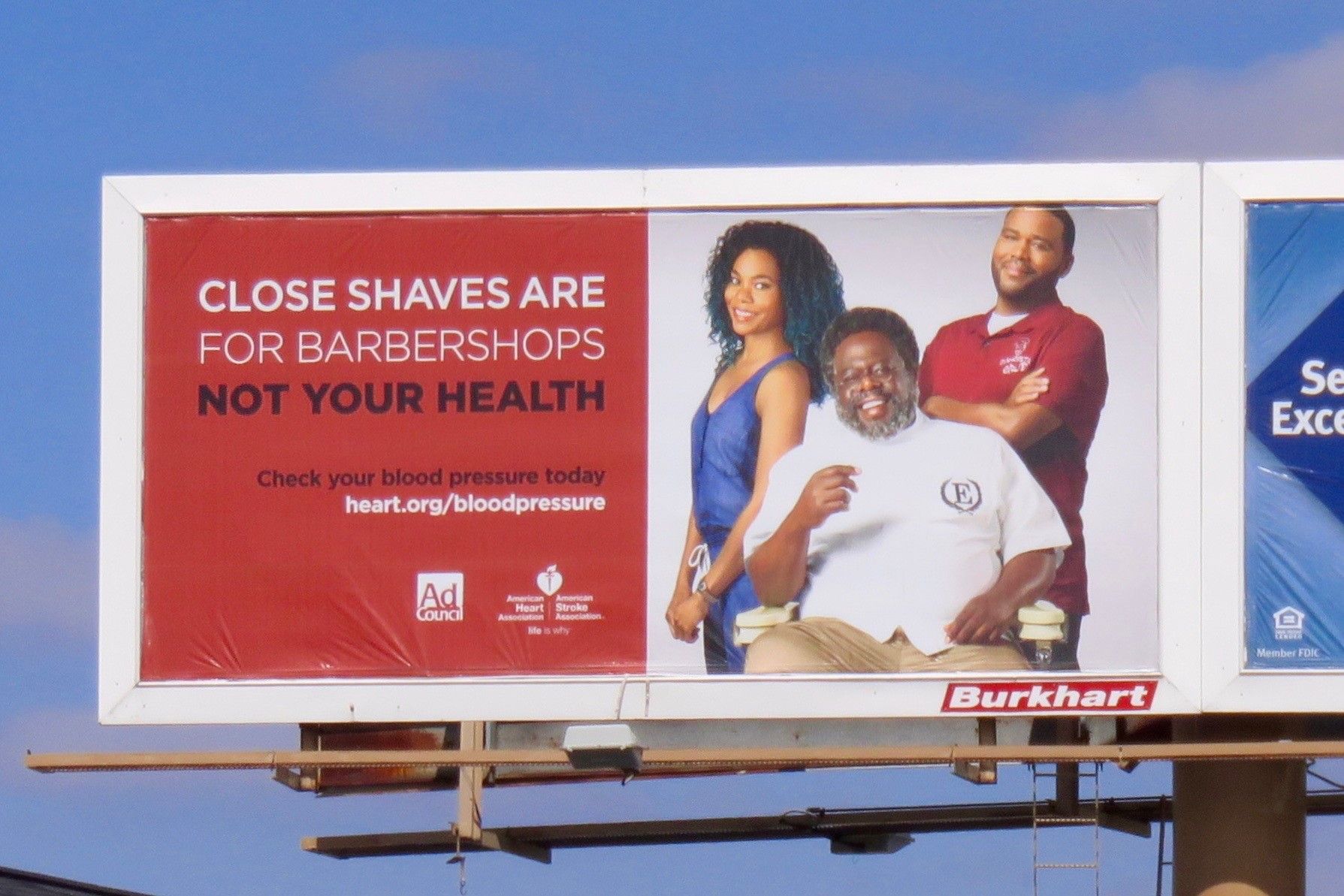
Take this billboard I photographed earlier today. Even sitting here right in front of you, I suspect you are having a hard time reading anything more than the three line headline. Now imagine seeing this from 200 yards away at 40 MPH.

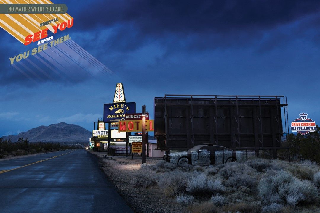
And here’s a billboard for the National Highway Transportation Board downloaded right from their website. I know it is intended to mirror the TV PSAs they have been running and while I appreciate the attempts to maintain cross media continuity, sometimes it just doesn’t work.

On a more universal level, I think the problem of bad billboard design is attributable to the fact that many of the rules for design in print and other media just don’t apply to outdoor. A print ad, for example, is designed to be viewed up close and personal. Outdoor is not. It is typically seen from a moving vehicle at a great distance. So the message must register in a matter of seconds. The viewer can’t sit and ponder its meaning. The impact must be instantaneous.
By contrast, the art director is viewing the design mere inches away from the screen and can spend hours fine-tuning it to his or her heart’s content. I’m not saying art directors shouldn’t spend the time getting it right. Quite the contrary, they should devote whatever time is necessary to fashion a design that works in the environment in which it will be seen.
Other common billboard design mistakes in my opinion:
-
Too many words. Full disclosure, I have been guilty of this sin myself on more than one occasion. It’s hard to say something meaningful in less than 10 words, but one has to try.
-
Too many design elements. Multiple images, be they logos, photos or different fonts, all tend to clutter the space, compete for the viewer’s attention and diminish the impact of the overall message. Also, a single large photo is nearly always preferable to multiple small ones.
-
Condensed or hard to read fonts. They may seem cool or fun, but if they get in the way of readability, they are probably a bad choice.
-
Lack of contrast. Headline fonts need to stand out from the background for maximum visual impact.
-
Environmental considerations. One time we designed a very nice billboard for a client but it had one unintended flaw. The sky blue background blended right in with the blue sky, making readability a real challenge.
Some people think outdoor is a great medium. Others disagree, for a variety of reasons – ranging from personal distaste for environmental reasons or the simple belief billboards are ineffective. I believe outdoor can be very effective, but only when properly designed.
To get our latest articles when they are posted, please subscribe by e-mail or RSS.
