Making Digital Look Analogue: Visual Trends in Web Design
Any physicist can scribble equations on a chalkboard to show us that analogue materials can be represented as wave functions while digital objects are made up of zeros and ones. But normal folks (no offense, Stephen Hawking) don’t think in mathematical terms. What the scientist calls analogue, you and I call “real”. Stuff you can feel and touch: trees, books, people. Digital, well, that’s fake stuff: drop-down menus, video games, the Na’vi. As much as we love and embrace the digital world, we tend to like it served up with a great deal of realism. We want it to feel natural. Digital or not, most people tend to prefer things that look analogue.
Several posts back, I wrote about the blurring line between analogue and digital media, showing how old and new display technologies are converging rapidly. Devices like the Amazon Kindle and Apple iPad mark a pragmatic middle ground between the analogue world of traditional publication and the digital realm of the Internet and so-called “new media”. The common perception of a real difference between the two is dissolving, so it’s really no wonder that we should be seeing signs of this inevitable fusion in other areas as well.
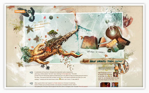
I’d like to hone in specifically on Web design where the nebulous border between analogue and digital is being compromised visually. Because more users have faster Internet connections and more advanced computers, more and more designers and programmers are taking advantage of this extra “umph” to create far more elaborate Web experiences. The result: many websites are replicating the look and feel of the analogue world we wake up in every day.
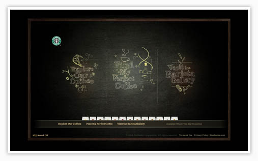
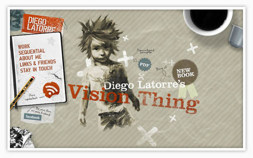
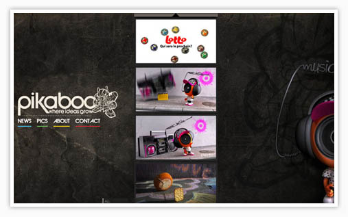
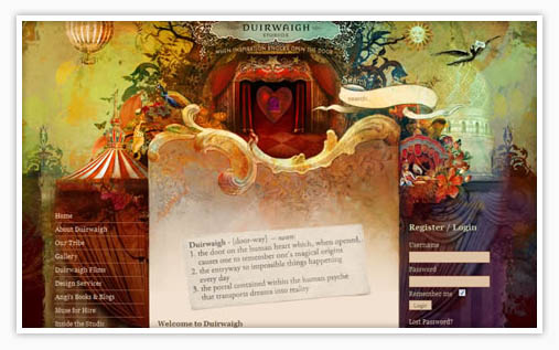
Some highly textured sites look as though they might physically exist on the wall of a warehouse. Other sites look organic, mimicking biological beauty in nature. Some sites look like drawings scribbled into a sketchbook or even traditional paintings. These “looks” give the user a visual experience that emulates the sensation of touch. Tactile descriptions like “gritty”, “smooth”, “sketchy”, “rough” can have real meaning when referring to a website. But each site is just a bunch of tiny glowing pixels that will vanish magically the moment you hit the back button!
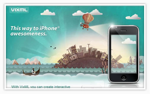
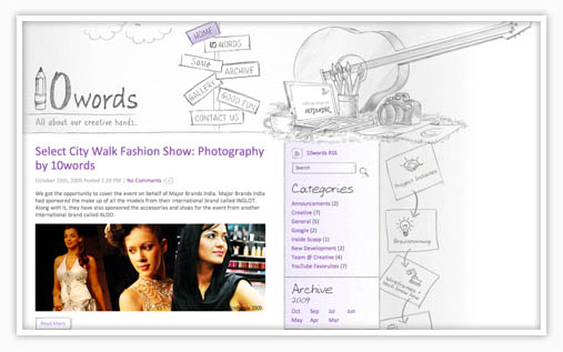
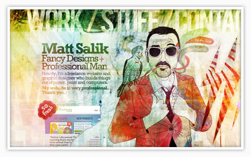
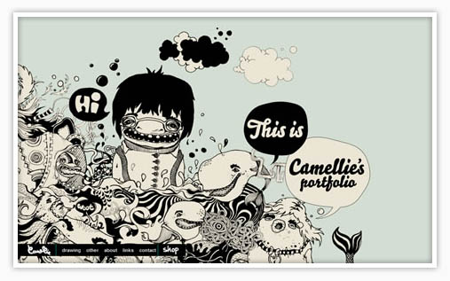
All that said, you really need to check out the mind-blowing examples below. I gathered together a collection of websites that each capitalize on the analogue “look” I’m talking about. Many seem as though they were traditionally illustrated using pencils and paints. Others employ rich textures and photos of real objects to introduce an overall analogue feel. All of these are awesome. Enjoy!
To get our latest articles when they are posted, please subscribe by e-mail or RSS.
